If you haven’t heard much about data visualization in the past few years, you haven’t been listening. Analytics companies and app developers have been pushing the narrative that data visualization is about to change the world—and for all we know, it might.
Data visualization is the process of taking data and condensing it to a much more intuitive, straightforward form, such as a chart, a graph, or some other visual depiction. Some platforms are capable of rudimentary projections along these lines, while others employ advanced machine learning and artificial intelligence (AI) algorithms to produce complex interfaces.
Companies and users all over the world are hailing data visualization as a new analytics revolution, but are they overhyping the possibilities?

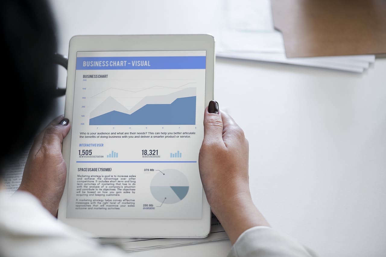
IMAGE: PIXABAY
The Arguments For Data Visualization
Let’s start by examining the case for data visualization, and how it could truly revolutionize the way we work and think:
- Learning and memory. Most people are better at learning visually, as opposed to any other medium or approach. When hearing information, people tend to remember about 10 percent of what they heard after 3 days has passed. An image with the same information, however, allows people to retain about 65 percent of the information after the same period of time. Accordingly, more data visualizations could help people learn, understand, and retain information better than ever before.
- Analytics accessibility. Visualization also has the power to introduce new groups of people to the field of data analytics. What was once a job centralized around number crunching and complex formulas could now be something that anyone with pattern recognition skills could accomplish. You don’t have to know the exact math if you have an algorithm that can show you how the data work.
- Meetings and interdepartmental communication. Data visualization can also bridge communication gaps that might otherwise exist. For example, if you’re in a meeting with a client and are trying to demonstrate a point, showing them a dramatic graph is far more effective than trying to explain to them a complex statistical anomaly. Similarly, these tools may allow different departments to communicate more effectively with one another.
- Value and efficiency. Visualizing data also allows you to understand high-level concepts like value and growth, without getting into the weeds of examining individual variables. For example, you can decide if a given tactic is valuable by looking at high-level projections of its costs and potential returns, rather than speculating based on the individual numbers alone.
Why It Could Be Overhyped
But how could it be overhyped?
- Purported novelty. Many people are excited about data visualization because it represents something new and exciting in the field of data analytics—but the concept of data visualization isn’t exactly new. People have been using bar charts and similar graphs since 1780 (or even longer), and there are dozens of charts and graphs you can create using nothing more than the data in an Excel spreadsheet. Accordingly, data visualization isn’t quite as new as we think it is—it’s just being applied to more areas and is becoming more important with greater data variables being measured.
- Potential for misinterpretation. We also need to acknowledge that presenting data in the form of a chart or graph makes it intuitive, but also more vulnerable to misinterpretation. Aggregated graphs have a tendency to mask outliers or project trends that may not be inherently implied by the data. If users begin to over-rely on simplistic visualizations, they may find themselves drawing inaccurate conclusions.
- Engineered algorithms. The potential for advanced algorithms generating their own graphs based on trends they detect is exciting, but keep in mind, these algorithms were designed by human beings—and human beings are fallible. Algorithms that produce data visualizations may be prone to the same biases and limitations of the people who created them.
- Current limitations. Researchers are starting to push the limits of what’s possible with data visualization, exploring the possibility of high-dimensional projections in low-dimensional space. However, these are early experiments that haven’t yet made much progress. For now, we’re relatively limited in how we can create and understand data visualizations, and that makes it difficult to predict a massive paradigm change.
So is data visualization overhyped? There’s certainly ample credibility to the statement that data visualization is powerful, and could change the way we work, but it may not be as all-powerful, as new, or as “revolutionary” as some have claimed. It’s a fantastic tool to add to our existing systems, but it’s probably not going to change the world—at least not anytime soon.
If you are interested in even more technology-related articles and information from us here at Bit Rebels then we have a lot to choose from.
COMMENTS