Social networking sites are changing so fast. In as little as a matter of weeks, dramatic changes can take place. Even if you have the best intentions, sometimes it’s hard to keep up with the pace.
Avid Internet users are known for having short attention spans, so each one of these sites has to work double time to keep our interest. Some sites are able to stand the test of time while others come and go in the blink of an eye.
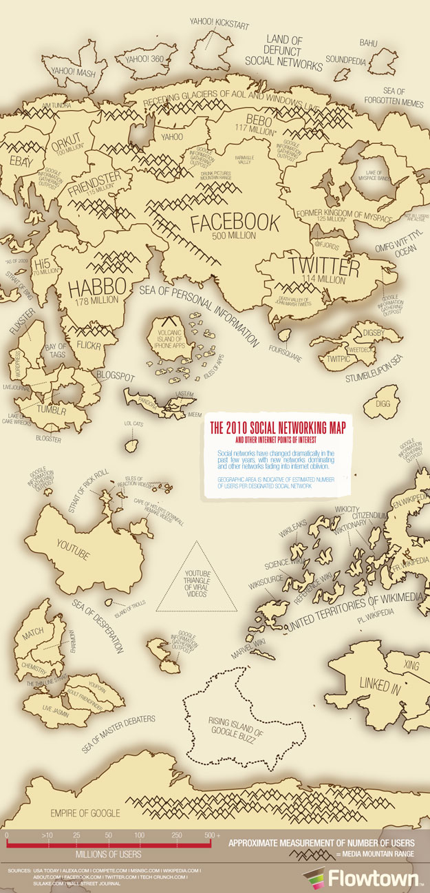
The wonderful people at Flowtown created this fabulous 2010 Social Networking Map. They consulted USA Today, Alexa.com, Compete.com, MSNBC.com, Wikipedia.com, About.com, Facebook.com, Twitter.com, TechCrunch.com, Sulake.com and the Wall Street Journal to gather their stats and relevant information. As you’ll see on the map, each “geographic area is indicative of the estimated number of users per designated social network.” This very creative way to illustrate this concept makes it simple and easy to understand.
There are a few sites left off, like Posterous (they forgot), Craig’s List (they said isn’t social) and renren.com. Of course, Google Wave should be removed. This looks like it took a very long time to create. Thank you for all your hard work! I give this 5 stars! If you would like to get a hi-res version of this to print and hang in your office, just email help@flowtown.com. They’ve offered to send one to anyone who asks for it.
COMMENTS