Lately here on Bit Rebels we have started to publish some freakishly interesting and beautiful looking infographics that shows us, in a simple and understandable way, the subject of the article. Infographics have long been the most profitable way to get a message out there, and more than often than not, they go viral since it’s easy and time saving to write an article about it. An infographic can portray pretty much anything you want it to, but it’s the design of it that matters. If you don’t get it down into a simple and straight forward design, you will lose the viewers as soon as they lay eyes on your graphics. Also, to include too much data on an infographic can throw the readers off, thus making them not investigate it further.
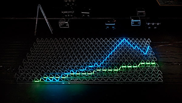
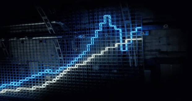
BT Financial Australia decided that an ordinary, boring graphical infographic was nothing they wanted to waste time on, and they started to brainstorm about other possibilities. They began thinking about neon lights and how they could portray their statistics. With intricate frame designs and a bunch of neon lights, they put together something that could only be described as a beautiful technological achievement.
Their way of using lights to draw up charts and showcase several financial claims is a technology geeks wettest dream come true. Not only is it visually stunning, but in the year of 2011, it makes perfect sense to step out of the box and do something more futuristic. Now, will infographics be changed forever or is this just going to be a clever commercial that will fall into the shadows of our minds? I guess we’ll just have to see what happens. Nevertheless, it’s amazingly beautiful!


COMMENTS