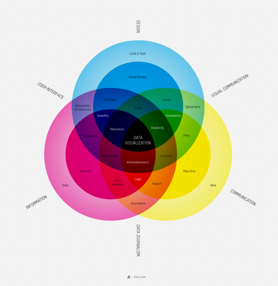
Data visualization comes in many forms and differs depending on what angle you want to showcase it. As a designer, it can sometimes be hard to know what way would be most beneficial to design an infographic to get the viewers to understand every aspect of it. Usually it is pretty straight forward, but there is somewhat of a silent code within the design community that there are some guidelines that should be considered in order to fully utilize the way data is visualized graphically. The more creative you get can sometimes clutter and spoil the immediate reaction to your attempt to make something complicated look simple. Often it will come back around and even complicate things even more.
The founder of ffunction, Sébastien Pierre, put together a really useful chart which can serve as a little tool when working with data visualization. You can look at it as a “What is Data Visualization” guide. Depending on what way you angle the sheet, you will get different results. It all depends on what angle you want to showcase your data.
It might look a little bit confusing, but stick with it for a few moments and you will soon realize it’s actually simpler than you first thought. It’s the impact of the massive information effect you’re experiencing. It’s the same effect that someone who is not used to working with music feels when they walk into a studio with a 128 channel mixer console. All they can think of is how on earth you can know what each and every knob, button or fader does. That’s just the thing, if each channel has 50 different features, that would make it 6,400 different buttons, knobs and faders to the inexperienced. However, it’s far easier than that. Each channel has exactly the same features as the channel before it. This way of looking at it you only have to know what those 50 different buttons, knobs and faders do. Pretty simple, right? So, it’s the same thing with this chart. Just look at it and follow a straight line to the center from a straight angle from where you’re sitting. There, you mastered it!
Click Image To Enlarge

COMMENTS