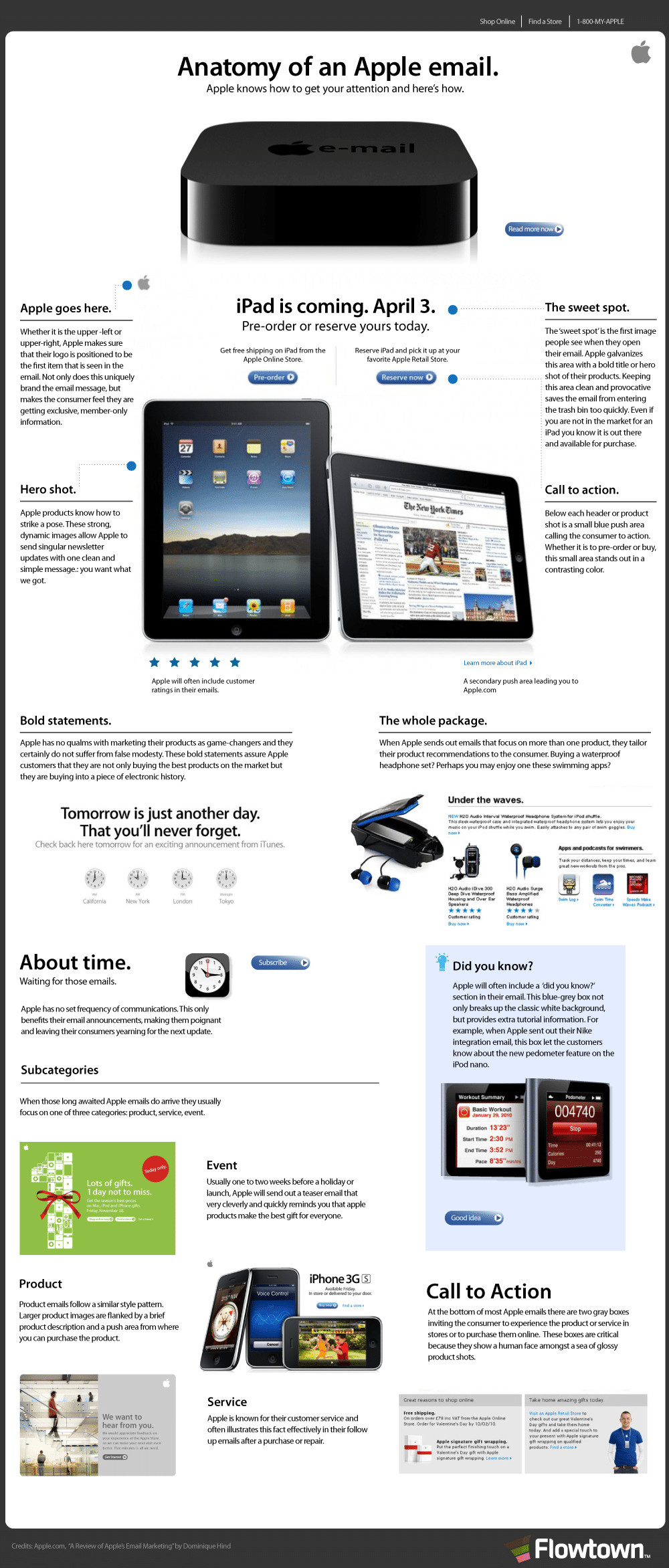
Every now and then we see stuff that would totally catch the interest of designers and marketers, while not so much as make ordinary people even glance at it. It’s, of course, really easy to understand why as both designers and marketers want their things to be seen. However, when you start getting into infographics, you go to an entirely different level. Then, suddenly everyone wants a peek and to read through it. It’s quite simple really, in this day and age we have become too lazy to get into any kind of extensive reading. If we can get fed with the data in just one picture, no matter how tall it is, we will devour it like it was our first meal in month. That’s one reason why infographics have grown to become quite a large business. Yes, people make a lot of money creating these badboys.
So, to get back to the point of this article, I want to say that once you have received an email from Apple, you instantly know from then forward which emails are from them. Their layout is unique and simple, yet the impact is enormous. There have been plenty of people who have tried to decipher these emails in search of the holy grail, but they stumble over one important fact.
The reason why Apple’s emails look miles apart from any other marketing emails is because of that one fact, it’s from Apple. And no, it’s not because it’s actually from Apple, but because it is by Apple. I can understand if you’re lost right now. What I mean is that the emails that come from Apple have Apple products in them, and thus they will send a certain jolt to your brain telling it it’s pristine (depending on what your experience is with Apple that is). If you’re still interested in knowing the ins and outs of an Apple email, Flowtown put together this anatomy study, or infographic if I may, about how they are formatted. So to all of you designers and marketers out there, go nuts!
Click Image To Enlarge

COMMENTS