Lately, I’ve seen a lot of people go back and forth online debating about what typography actually is. I guess since I’m not a designer, I am excused from not knowing how the traditionalists view it. To me, typography is text in different colors, fonts, shapes and sizes put together to create some sort of communication.
Look around you now, I bet you’ll see several different typography examples without even having to turn your head. Misty touched on this in her article entitled Typography Everywhere – Inspiration Is All Around Us. It’s easy to take typography by creative designers for granted because it’s just there, everywhere. It becomes a staple in our life, and sometimes we don’t even notice it.
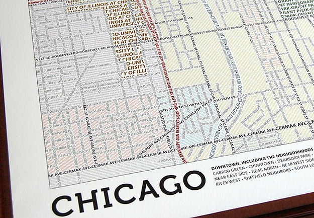
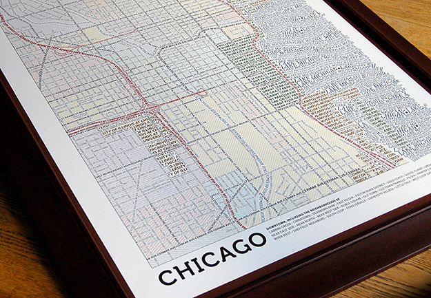
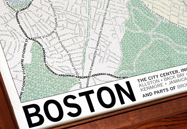
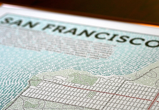
Once you start to really pay attention to typography, you realize how inspiring it truly can be. It’s an art form all its own, and I can only imagine where designers find the inspiration to create some of the typography that gets tattooed on our brain forever. Here is an example of some very interesting typography. These are city maps made completely out of text. How creative is that? Axis Maps recently released these typographic maps.
Every single piece of type on these maps was manually placed and woven together with other pieces. Each map took hundreds of hours to create, and it’s obviously a labor of love. Currently they’ve finished downtown Chicago, Boston and San Francisco. They are working on New York (Manhattan) and Washington D.C. If you love maps, and if you are inspired by typography, you can purchase a print of one of these maps for only $30 on the Axis Maps website. Nice!
Image Credit: [Design Don’t Panic]


COMMENTS