It’s not often we pass up a good infographic here on Bit Rebels, and there is of course a reason for that. We are huge information gobblers, and we can never get enough of geeky stats. You could start to question why that is, and the only answer I have is that we learn from it. It’s the best and most optimized way to get a day’s worth of statistics in just a few minutes. As you all know (or at least the ones who have read our mission statement), we try to deliver current events, geekiness and news in a format that will take you no longer than a few minutes to soak up. That’s what we are all about, and that’s how Bit Rebels was born.
When it comes to the creativity of infographics, there are always things that will catch us off guard because we haven’t seen them before. Infographics have different art, lineups and execution styles, but they seem to always follow the same mold if you know what I mean. It’s like they just have to be the same over and over again because certain ones work. Well, Google has a whole different view of that, and when they do something, we all know it’s going to create ripples.
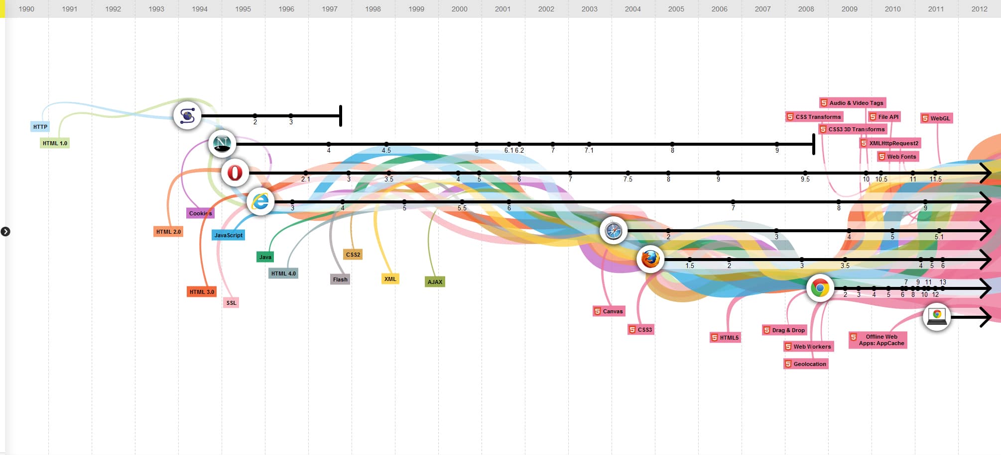
Recently I stumbled over their interactive The Evolution Of The Web infographic that is quite amazing to be honest. It looks deeper into the popularity of browsers and the version of scripts they use such as HTML, Java, CSS, XML and others. They are all in there, and Google tracks their popularity every step of the way. As a matter of fact, they have been tracking this information since back in 1990. You need to have a look, and it will do you good if you are a web developer because you will stay on top of the most popular of web trends when it comes to all things programming and developing. It’s a brilliant idea with a genius execution. I love this stuff!
Click Image To Enlarge or Click HERE To Interact

COMMENTS