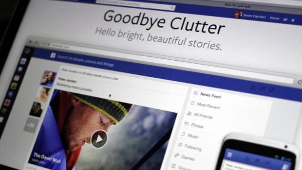
There are currently a lot of redesigns being pushed out on social media sites. Most people welcome the new and more optimized redesigns, but there are plenty of people who are getting a little fed up with the constant changes. Not only does it break the flow we are used to since we know how to navigate these websites by now, but every new redesign means we have to once again recreate our header images and whatnot. The Facebook redesign avoided that by just updating their news feed design.
Many people wonder how these new redesigns are conceived. Usually it’s a process that spans several months when it comes to the giant social networking sites. That’s not because they are particularly hard to code, but because they have to make absolutely sure that the design they push out is optimized for all of their users. The Facebook redesign seems to have hit the sweet spot. People across the board are pretty happy about the changes. It makes it easier to read and a whole lot easier to navigate. Not only that, but it looks quite nice as well, which is something that Facebook is not exactly legendary for.
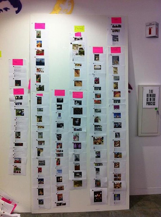
So how was the new Facebook redesign conceived? Well, according to Facebook, the new Facebook redesign was not conceived in a digital way at all. It was conceived the old fashioned way, by using post-it notes and images on a pin board. Yup, that is right! Facebook even posted a picture on their blog about the procedure, and how the finalized Facebook redesign and news feed looked on the pin board itself.
As you see, not everything has to be digital to the point of fitting into the latest blockbuster science fiction movie a’la Iron Man. It’s all about making sure things are easy to understand, and that it moves forward in a user friendly way. What else would you use other than trusty ole post-it notes and a pin board, right?


COMMENTS