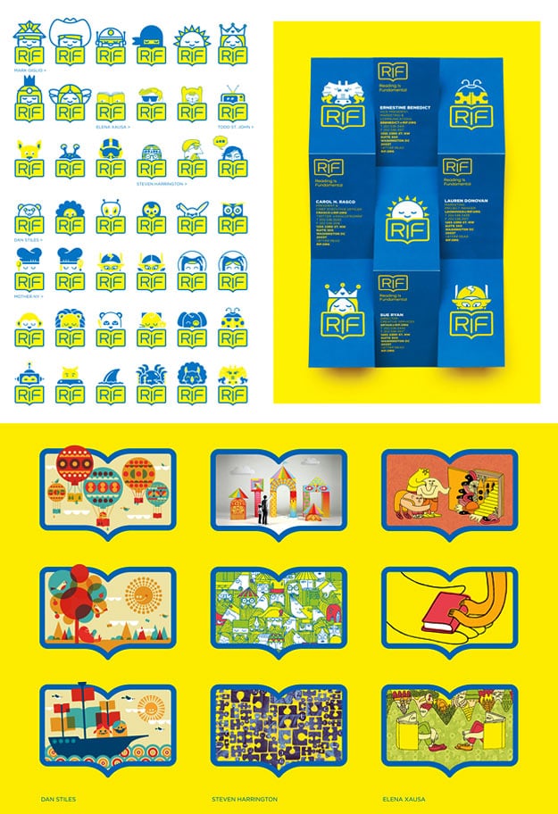
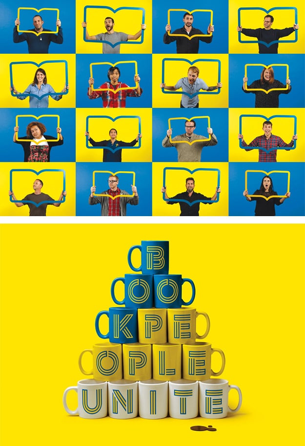
I am writing about this because I personally like the mission of the Reading Is Fundamental organization. It also hit my design radar because the illustrative icon designs and other work the New York agency and other contributing artists (Steven Harrington, Mark Giglio, Todd St. John, Dan Stiles, and Elena Xausa) put together is really solid work for us illustrative geeks reading Bit Rebels. This large creative team made a set of iconic illustrative logos to tell and revive the Reading Is Fundamental story, which includes their mission to provide millions of free books and literary resources to kids in underprivileged communities.
The New York agency, Mother, is helping RIF gain momentum in their goal to be relevant, current and “on trend” in today’s society. According to agency art director Christian Cervantes, the new identity seeks to create “an emotional connection to the brand, so in creating the identity we wanted it to appeal to their inner child…”
The logo marks are all centered on a simplified book-shaped logo that the designer(s) integrate into the RIF visual branding in various ways. The book’s illustrative element is the design device that glues the entire identity system together in a way that brings consistency and cohesion throughout. This is good illustrative story telling, in my opinion, even though I was shocked at the sheer number of icons when I viewed them all together on a one-page graphic. I had to recall, as an experienced designer, that this is not the intended use or way that the viewer is supposed to experience the logo design symbols.


COMMENTS