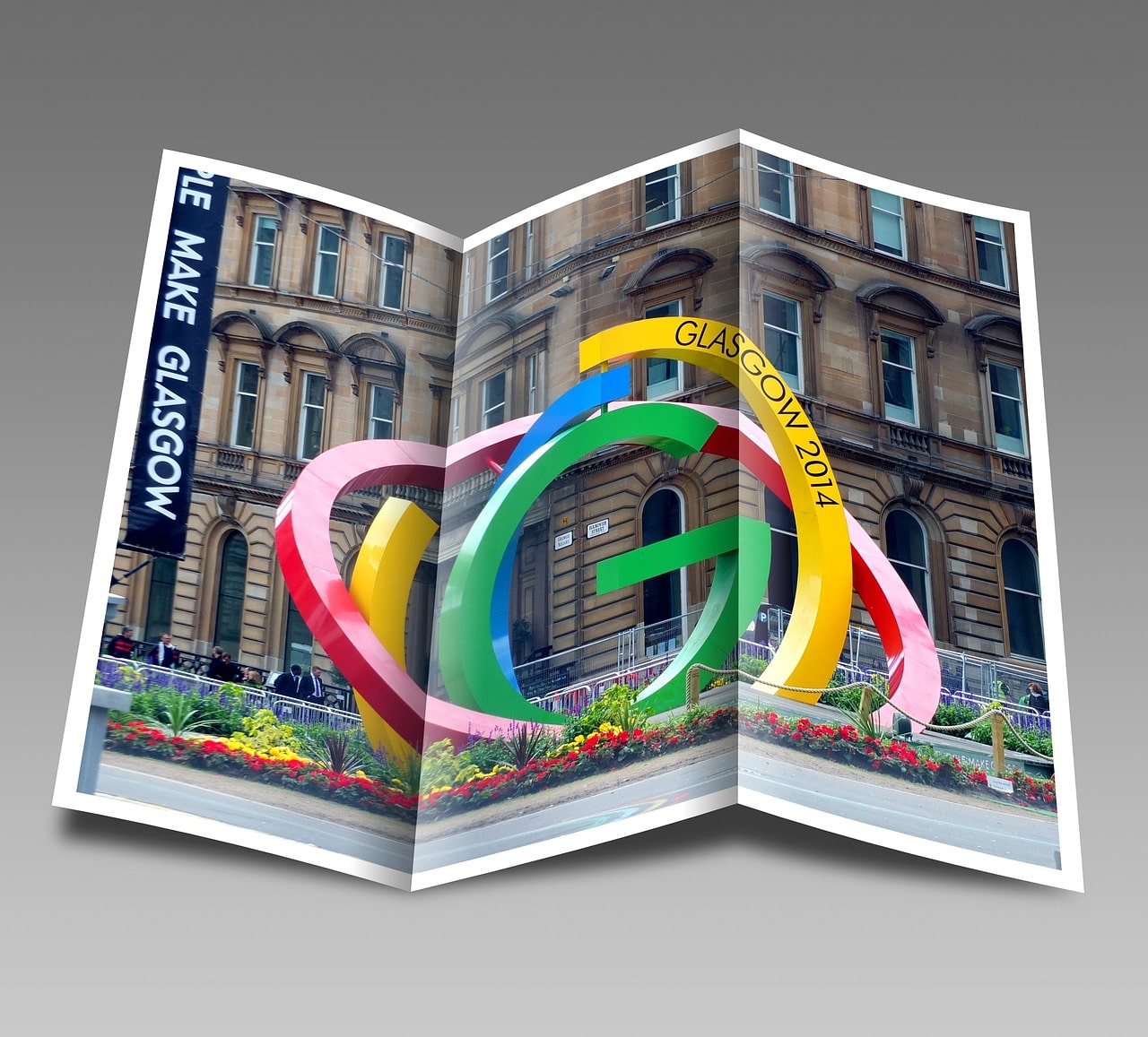
Let’s be honest for a moment. How many of you make a swift diversion from anyone holding out leaflets on the street or at a train station? Probably 99% of you, right? But why do most of us do this? After all, for the general public, leaflets can contain useful information about anything from an upcoming event to a “50% off sale” to a new store opening – information that doesn’t hurt us in any way.
The reason we may dislike leaflets (well, perhaps not as much as this marketing expert) is that the message is – more often than not – presented in a haphazard, ugly, and downright boring method. We don’t like receiving leaflets, not because of what it’s trying to tell us, but how it’s presented. But what if you could change all that?
For the sake of this example, let’s pretend you’re designing a leaflet to promote the opening of a brand new coffee shop. How would you design a leaflet to grab someone’s attention in the quickest possible way? Here’s how.
IMAGE: PIXABAY
Headline
This has to be something that really jumps out of the gate. Coffee shops are a dime a dozen in every major city and town – not to mention different ways to get caffeine in your body – so to convince someone to check out yours via a leaflet is no easy task… but you’ve still got to try.
Headlines such as “New Coffee Shop” or “Brand New Coffee Store” are a bit weak and likely won’t muster that much interest, but what if you tried something out of left field? A headline like “You Need to Wake up!” or “Is it Time for Coffee?” are more personal and evoke feelings of drinking coffee, rather than simply visiting a store.
Main Picture
Seems obvious, but this needs to be related to what your leaflet is about! Like the headline, try to evoke feelings. So, rather than simply a picture of a filled coffee cup, a close-up photograph of someone actually holding a freshly made coffee is much more exciting and interesting.
Call To Action
This should, of course, entice the reader of your leaflet into visiting the store. Many shops give the option of 30% off a coffee or a free muffin when someone presents the leaflet. This free or subsidized offer needs to be highlighted with a large star – something to grab attention and hopefully make the recipient interested in checking out the shop.
Extras
The details don’t have to be particularly long when it comes to information on a leaflet, as people would much rather read short sentences and look at pictures when it comes to this type of advertising, simply because these are often read on-the-go. The address of your store is obviously a must, plus a few further details about the décor, location, social media info, phone number and some pictures of items on your menu.
Paper Type
Although it’s not unusual to see double-sided leaflets, a coffee shop opening would really only need one side. A5 is perhaps the most common size for a leaflet, as it has to be small enough to fit inside a jacket or jeans pocket, for example. As for the paper type, glossy usually looks and feels better, but going with a matte finish is not at all an issue.
When your design is set in stone, it’s best to think about leaflet printing at somewhere like print24, as it can tell you more about prices for your desired quantity. 500-750 leaflets would likely be a good start if you live in a major city.
Typos
Finally, make sure you get someone to check your leaflet design before it goes to print. It would be horrible to distribute these knowing that there’s a misspelled word somewhere on there.
If you are interested in even more design-related articles and information from us here at Bit Rebels then we have a lot to choose from.


COMMENTS